

Colour theory, grounded in the study of the primary wheel colour, is best described as a series of concepts that blend something scientific with something artistic, and it gives designers, artists, decorators, and photographers a toolbox of tips and tricks for building strong colour combinations..
Whether you call yourself a painter, a home renovator planning an outfit update for a room, or someone dressing for the day, understanding colour theory brings confidence to your creative life, even though the subject can feel complicated at first glance.
My own time spent staring at paint swatches taught me that once you grasp the basic principles, you can experiment with a combination of colours and land on innovative pairings that create truly harmonious colour schemes.
Primary Wheel Colour
A colour circle, also known as the primary wheel colour, is the classic illustrative tool for artists most of us remember from art classes with a patient teacher at the front of the room. Back in 1666, Sir Issac Newton yes, the same Isaac Newton famous for gravity ran his prism experiment and split the light spectrum into seven colours, giving us the theory of light that still shapes how we understand the visible light spectrum today.
Itten’s Colour Wheel
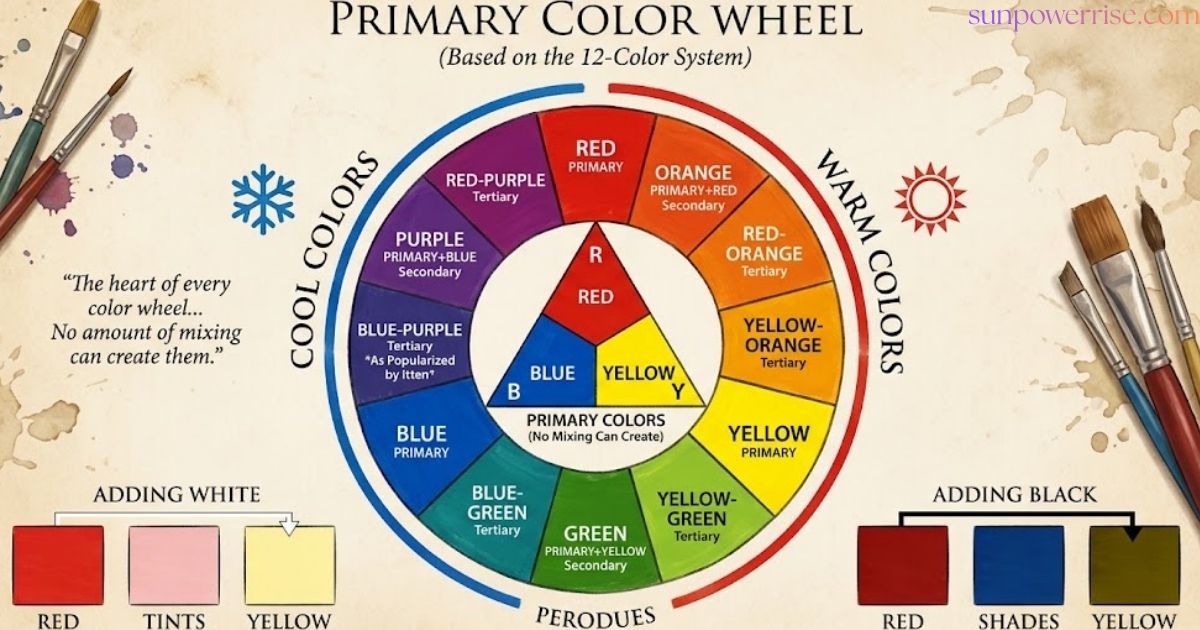
Centuries later, Johannes Itten of the Bauhaus school placed twelve colours around a triangle at the centre, arranging primary colours, secondary colours, and tertiary colours into what we now call Itten’s colour wheel, a design built for finding harmonious colours and pleasing colour pairings.
Additive Colour Method
There are actually two methods of producing colour, and knowing both changes how you read any painter’s colour wheel. An additive colour method relies on coloured light, the same way a computer screen or TV screen starts as a black screen before pixels and tiny pinpoints of light mix white light to build images; on this colour wheel, primary colours are red, green, and blue.
Subtractive Colour Wheel
A subtractive colour wheel, by contrast, is the one every painter actually uses, since paint, dye, pigment, and other colourants work by reflecting sunlight off a surface. When white light hits an object, the object absorbs some wavelengths of light and reflects off an object only the hues we perceive as visible colour.
Primary, Secondary, and Tertiary Colours
On any Primary wheel colour, the 12 colours split into 3 main groups, and that grouping is really the make-up of the colour wheel itself. Three primary colours true red, yellow, and blue form the foundation, since primary colours cannot be created by mixing any other colours; think of them as the parents of the remaining nine hues, and every serious painting session starts with a true red on hand alongside true blue and yellow.
Secondary colours come next, made by mixing equal parts of two primary colours: red + blue = violet, red + yellow = orange, and blue + yellow = green, giving us violet, orange, and green sitting between their parent hues on the colour wheel.
Then come the tertiary colours, and there are six tertiary colours in total, each formed by blending a primary hue with the neighbouring secondary tone: blue-violet, red-violet, red-orange, yellow-orange, yellow-green, and blue-green, each carrying a mix of primary and secondary colour.
Tints, Tones, and Shades
If your favourite colour never seems to show up cleanly on the primary wheel colour, there’s a simple reason: most shades we love are actually derived from the 12 basic colours through mixing colours with white, grey, or black.
This technique is easy to learn: adding white creates a tint, so pink is really just a tint of red, a variation of colour hue rather than a stand-alone hue; meanwhile, adding grey to a colour hue produces a soft tone, and adding black to a colour hue will darken it into a shade.
Many artists build entire paintings around shades and tints taken from just one colour, and these mixes are perfect for natural-looking highlight and shadow colours that give a painting real depth.
Colour Harmony Rules and Colour Schemes
Once you know your Primary wheel colour inside out, it’s time to learn the colour combination rules that turn random hues into harmonious colours. There are four basic colour schemes worth knowing: monochrome, complementary, analogous, and achromatic, and each one produces different effective pairings depending on whether you want a calm, harmonious feel or a bold statement. These colour schemes all aim for one thing: a result that’s genuinely pleasing to the eye.
Complementary Colours
Complementary colours sit directly across from each other, exactly opposite on the colour wheel, and pairing them together creates a strong impact because each colour seems to brighten and strengthen the other’s brightness.
Think of pinks against greens, or oranges against blues these complete opposites, taken from the opposite side of the wheel, deliver a bold, high-contrast result, and I’ve watched a single accent wall with complementary colour schemes really pop in a living room.
If you want the same high-impact look without overwhelming a room, try softer neutralised shades and tones on woodwork, cornicing, dado rails, or other picture rail ideas, since even muted colours can carry the drama of a true complementary pairing.
Split Complementary Colours
A split-complementary colour scheme softens the drama of a straight complementary colour pairing by using three colours instead of two colours. Instead of clashing head-on, you pick one primary colour and then choose the two colours sitting immediately to the right and left of its complement, giving you three colours that stay adjacent to true opposition without feeling too busy. For the best palette, let one shade act as the dominant colour while the other two work quietly as accent colours.
Analogous Colours
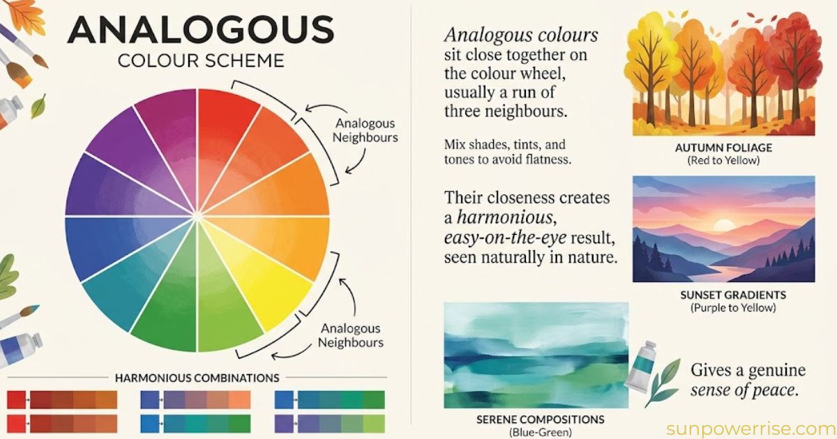
Analogous colours are simply three or more colours that sit next to each other, or at least close to one another, on the colour wheel. Imagine red sitting next to rust, which sits next to terracotta, a group of shades, tints or tones that feel instantly compatible.
This kind of analogous colour scheme creates a genuinely harmonious composition, and because these three neighbouring colours are adjacent, the result stays subtle, soothing, and easy on the eye, echoing the kind of natural blending we notice everywhere in nature.
The one risk is that everything ends up merging together, so whether you’re working on a graphic design project or a paint scheme, pick one main colour or one primary colour to lead, and let the rest act as supporting colours that bring a quiet sense of peace to the whole harmonious palette.
Monochromatic Pairing
A monochromatic scheme, often mixed up with plain black and white, actually gets its name from the Greek words mono, meaning one, and khroma, meaning colour.
Building monochrome this way means picking one colour, say blue, as your base colour, then working through varying tones tints and shades of that single hue. It’s a conservative choice, but it reliably produces harmonious colour palettes and a harmonious, visually cohesive look, since every tone and shade traces back to the same root colour.
Triad and Triadic Harmony
A triadic colour scheme picks three equidistant colours, equally spaced apart in a triangular shape around the colour wheel. This gives you three colours with real contrast a highly contrasting palette that feels bolder than any analogous colour scheme, though not quite as intense as pairing straight complementary colours. The result is a lively composition full of vibrant looks.
Square Pairing and Tetradic Harmony
A tetradic colour scheme, sometimes called a rectangular colour scheme, uses four equidistant colours arranged in a rectangular shape around the colour wheel really just two pairs of complementary colours working together to build harmonious combinations.
Because this colour palette brings in 4 colours at once, the safest approach is to let one shade become the dominant colour while the rest act as supporting colours, keeping the whole thing well-balanced instead of chaotic.
If you want an even bolder, colourful, and vibrant result with a higher contrast look, try a square colour scheme instead, where colours sit spaced apart at an equal distance apart, giving you strong complementary colour pairings on every side.
What Is Colour Theory?
The study of colour theory has a long and storied history, stretching back to Aristotle, when philosophers first debated the mixing of colours and how blending could produce new colours.
Later, scientists turned their attention to vision and the influence of light, studying exactly how light shapes the colours we can see, while a more modern approach in the 18th century gave us terms like primary colours that we still use to define colours today. From there, the artistic tradition split away from the scientific one.
Today, colour theory offers practical guidance for visual artists and designers who need to mix colours, build colour schemes, and understand how colours created, combined and used relate to one another, with the colour wheel standing as the main tool behind it all.
Achromatic Colour Schemes
Finally, there’s the achromatic colour scheme, which literally means without colour and relies purely on a mix of blacks, whites, and greys, perfect if you’re after a clean minimalist look.
To avoid your home looking like old great-grandparents’ photographs, add just a hint of colour through the undertone: our Grey 01 and Black 01 both carry blue undertones, yet one reads soft and gentle while the other feels dark and dramatic. Similarly, Grey 03 hides lavender notes, giving one version a subtle, delicate touch and the other a moodier, more cocooning feel.
Colour Wheel Art
Making your own Primary wheel colour art is a genuinely fun way to keep learning colour theory hands-on. Mixing colour while painting lets you experiment freely, and the blended colours you end up with often turn into something surprisingly beautiful.
Warm and Cool Colours: A Tale of Two Halves
Split the primary wheel colour down the middle, and you get two halves: warm and cool. It’s fairly intuitive once you see it warm colours feel bold and vivid, seeming to take up space and look larger on a wall, while cool colours feel calm and soothing without trying to overpower the room. Meanwhile, white, black, and grey sit outside both halves entirely, acting as neutralising shades that balance either side.
FAQs
What is the primary colour in a colour wheel?
A primary colour is one of the base colours red, yellow, or blue that cannot be made by mixing any other colours together.
What are the primary colours?
The three primary colours are red, yellow, and blue, and every other colour on the colour wheel is built from these.
What are the primary and secondary colours on the colour wheel?
Primary colours are red, yellow, and blue; secondary colours are orange, green, and purple, made by mixing two primaries together.
What are the three primary colours, in order?
The three primary colours, in the order most artists learn them, are red, yellow, and blue.
What is the least popular primary colour?
Yellow is often considered the least popular primary colour, since it can feel harsh or overpowering compared to the calmer pull of blue and the boldness of red.