

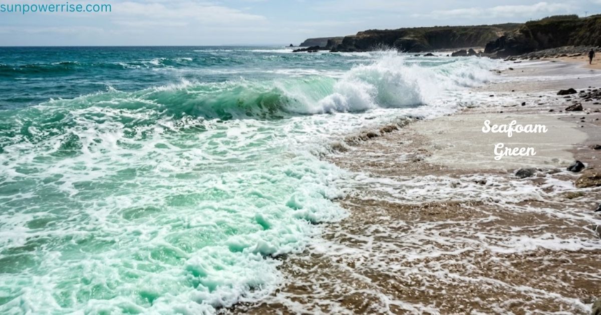
I still remember mixing paint for a client’s mood board, chasing a soft, dreamy shade somewhere between ocean and sky; that’s how I first fell for seafoam green. This gentle colour isn’t just another pale green; it carries a lightest-shade quality that feels almost weightless, like waters catching a light wash of morning sun.
Some call it minty green, others compare it to spring green, and the real seafoam you see foaming on ocean waves is actually white, which makes the meaning behind the name even more interesting.
This article walks through everything worth knowing: hex codes for digital wallpaper and colour palettes, notes on design, and a look at similar green shades that sit near seafoam in any swatch book. Whether you’re picking paint for a bathroom or building a brand palette, understanding this lighter, easy-to-love tone helps you use it with real confidence.
What Colour Is Seafoam Green?
When people ask me to describe seafoam green’s appearance, I picture mint green and sea green standing side by side; seafoam sits right in the middle, a soft, green-blue shade carrying a cool, watery hue.
Its official hex code, #93E9BE, sits close to light green and spring green on any hex colour chart, which is why web designers and developers sometimes use the names interchangeably, even though the swatches are technically different shades.
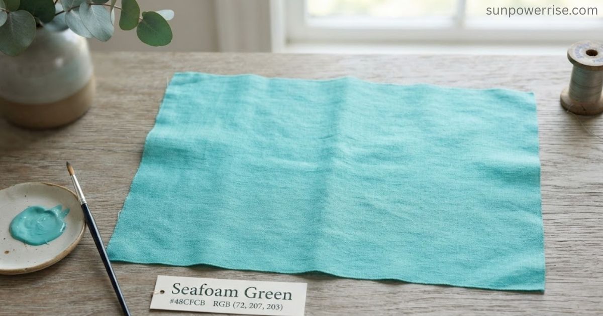
Scroll through a list of web colours looking for related colours, and you’ll spot Aqua, Cyan, Teal, and Aquamarine clustered nearby, all part of the same cool-toned family.
I like running a quick comparison using QuillBot’s free online colour palette generator you upload an inspiring image, and the tool pulls out dominant colour codes as a starting point for a full colour palette. Honestly, that free palette builder rivals paid tools I’ve used professionally when I’m shaping a fresh colour scheme for a client.
The History Of Seafoam Green
Every time I research the history of a colour, I find a good story, and seafoam green has one of the best. Pale-toned pigments first showed up in fashionable Europe as early as 1700, worn by nobles in the high courts who favored a soft, breathable pale green over the darkest greens of earlier decades. By the 1700s, these light shades had already earned a place among fashionable hues, long before anyone thought to name a single tone after ocean froth.
That naming moment came later. People assumed the frothy spume floating on ocean water gave the shade its name, though real sea foam is actually white, not green a fun mismatch I love pointing out at dinner parties.
The namesake stuck anyway, because the colour still calls the ocean to mind even if the science doesn’t quite match. Green, blue, and gray blend together to create that watery hue, and the mix carries a freshness no other popular shade quite matches.
During the 1950s, this vintage pastel swept through homes across the pastels-loving decade, showing up in bathrooms, kitchens, on tile, wallpaper, and even appliance finishes. I’ve restored a few mid-century houses myself, and I can tell you the popularity of that era’s clothing and interiors still shapes how people picture seafoam today.
What Does Seafoam Green Symbolise
Colour always carries a feeling, and in colour psychology, seafoam green sits in a genuinely interesting sweet spot.
Because it starts from green, it inherits strong associations with nature think trees, grass, and forests and it has long been seen as symbolic of luck, fortune, and renewal. Green also has a funnier side: people talk about jealousy as feeling “green with envy,” so the colour isn’t only about calm and freshness.
What makes seafoam different from a plain forest green is the blue mixed in. Blue brings tranquillity, especially through its flow of water imagery, while a touch of gray adds a bit of ambiguity, softening any sharp edge into a tranquil, balanced whole.
Pale greens also read as youth and innocence, which is why I use them for visuals aimed at younger audiences or refreshing designs meant to feel upbeat and friendly. The overall effect is restorative: green helps balance emotions and bring clarity to a cluttered mind. Even the sky and ocean echo this optimistic, lively mood.
How To Use Seafoam Green
I always tell clients that seafoam green is a genuinely versatile colour, one that stays easy on the eyes no matter the room. Because it’s such a subdued tone, it works as a great choice whenever the occasion calls for relaxation, freshness, or renewal. That’s exactly why greens like this show up so often in health food chains and supermarkets, where the brand wants to feel calming and clean.
In interior design, this shade’s ocean associations make it a natural fit for coastal or seaside-inspired bathrooms and other living spaces. I’ve used it on tubs, tile, and even kitchen appliances for its clean character, and I love pairing it with curved lines for a softer, friendlier feel.
Good health associations matter too; even simple appliances finished in this tone feel more inviting in a kitchen. During post-WWII homes, it stood alongside other popular shades butter yellow, soft pink, and baby blue as part of classic pastel colour palettes, and in 1950s kitchens you’d find it on wallpaper and kitchen accessories everywhere.
That kind of popularity never fully faded, and today the colour still gives a room a vintage feel without looking dated. Whether you’re renovating bathrooms or refreshing kitchens, seafoam remains a popular colour because it brings a splash of calm without demanding attention an underrated pick for anyone chasing both style and comfort.
Is Seafoam Green Or Blue?
People often ask me whether seafoam green leans more blue or green, and honestly, it’s a genuine mix of both. Like teal or aqua, this colour sits at a halfway point on the colour wheel, blending green base tones with just enough blue to earn its watery shade. A little gray softens the mix further, keeping it from feeling too bold like some other shades in that family.
If you ever want to paint a wall this tone yourself, start with a green base and add blue a small amount at a time, then finish with a touch of gray or white to lighten the result until it feels right.
What Colour Goes With Seafoam Green?
Styling seafoam green is one of my favorite parts of a design project, because so many colours pair well with it. Every colour choice here works whether you want a warm or cool overall scheme. Pair it with neutrals like taupe and it instantly reads as an accent colour, while a crisp white background makes it feel even more fresh and clean.
For a look inspired by nature and the outdoors, try analogous shades of green sitting beside it on the colour wheel. Since seafoam sits opposite red-orange, warm tones like coral, salmon, and tangerine bring real energy to the pairing, and it also looks lovely next to lilac, dusty pink, and dusty rose.
Seafoam Green Wallpaper
Beyond paint swatches, seafoam green also makes a beautiful digital wallpaper, and I’ve spent hours testing this on my own device. Using Quillbot’s online AI wallpaper generator, I can turn a handful of prompts into a full background wallpaper for any screen, whether that’s a smartphone, tablet, desktop, laptop screen, or even a tiny smartwatch.
For a smartphone, I lean on a minimal editorial style: a soft gradient, seafoam base, a subtle paper grain texture, plenty of space, and gentle abstract wave shapes in pale mint and off-white, with no text and no logos, all rendered in high resolution.
On a desktop or laptop screen, I switch to a primary colour of seafoam with muted accents of fog grey and warm white, arranged in a modern geometric composition of translucent layered rectangles and soft shadows, clean, calm, with no icons and no typography, all in ultra high-res.
A tablet wallpaper calls for an organic watercolour look: a seafoam wash background dotted with delicate speckles, light teal blooms, and faint sandy-beige highlights, finished with soft edges that stay minimal and serene.
For a smartwatch, I keep things even simpler a mint-to-aqua gradient with one centred abstract ripple ring for depth, built for high-contrast readability and crisp high-res display. It’s an iterative process, and every design ends up feeding back into a fuller colour palette and a proper wallpaper generator setup for next time.
FAQs
What colour is seafoam green?
Seafoam green is a soft, pale green-blue shade with hex code #93E9BE, sitting between green and blue on the colour wheel.
What colour makes seafoam green?
Mix blue into a green base, then add a touch of gray or white to lighten it into that soft, watery shade.
Why is seafoam green popular?
Its calming, ocean-inspired hue brings a sense of tranquility and freshness, making it a beloved choice in interior design and fashion.
Why is it called Sea Foam?
The name comes from ocean froth, though real sea foam is actually white. The colour simply evokes that fresh, oceanic feeling.
What colour goes best with Sea Foam green?
Coral, salmon, and white pair beautifully, while taupe and lilac add a soft, elegant contrast that feels effortlessly calming.